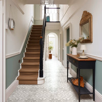
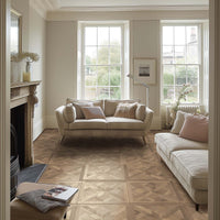
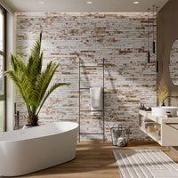
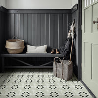
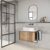
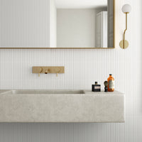
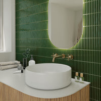
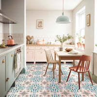
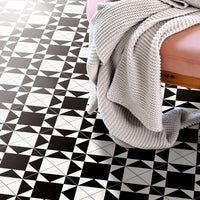
There has been much talk of soft sage green becoming the go-to shade for 2020, and Dulux has heard the whispers loud and clear. The paint giant’s colour of the year – Tranquil Dawn – offers a calm neutrality; a green that could easily be mistaken for grey. It holds a level of sophistication and can be effortlessly combined with a range of classic shades and many tile designs to create a homely atmosphere.
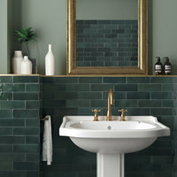
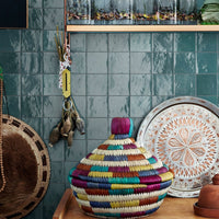
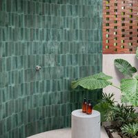
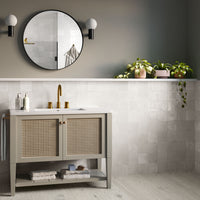
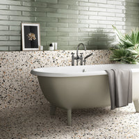
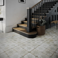
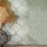
Browsing our ranges one can easily find this trendy shade in some form or another: from the light and minty Pastels Sage, to the mossy and moody Sage Metro Tile and its twin Arcade Crackle Moss. But the closest match has to be Padstow Sage, a coastal-inspired tile with a crackle surface that adds instant personality.
Dulux doesn’t leave us hanging, expecting us to combine the delightful shade at will. They also provide four colour sequences, offering ways to incorporate Tranquil Dawn in order to create the type of home we aspire to live in.
A Home For Care

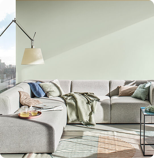
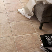
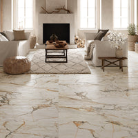
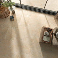
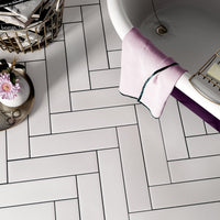
A Home for Care is awash with pastels, soft, gentle tones rooted in nature that provide an essence of calm. Similar shades can be found in our Marais Aqua, Opal White, and Polished Porcelain Beige designs.
A Home For Play


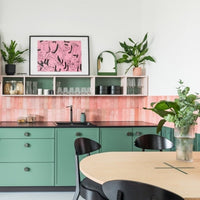
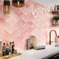
Dulux’s A Home for Play adds fun pops of primary colours, with a vivid red, sky blue, and mustard yellow, as well as pastels of pink and purple. Pastels Pink and Sky, blue, white, and yellow Tutti Frutti, and Palm Springs Pink all play into this vibe, and help display an element of fun throughout the home.
A Home For Meaning


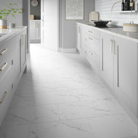
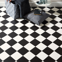
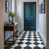
Dulux’s A Home for Meaning is much darker, with a heavy focus on grey, brown, and black neutrals. These tones go with everything and can act as a base for design exploration, or help create a serious space free of distraction. A variety of black and neutral tiles can be found throughout our ranges, from the unique and textured Zellige Black, to the marble-look Royale Midnight, to the perfectly patchwork patterned Casablanca Black. Each provides their own take on neutrality, and allow home owners to find their own interpretation, and meaning.
A Home For Creativity

Finally, Dulux’s A Home for Creativity is rich with earthy tones. Browns, blues, reds, and greens all have a place here, warming up interiors and filling them with character. These powerful pigments can be found in our Victorian Hexagon Red and Dorset Blue, while Lisbon Vogue has a similar earthy effect with a delicate aged patina.
Dulux’s Tranquil Dawn can be utilised throughout the home, with or without the colour combinations suggested by Dulux. For instance, Padstow Sage would make for a wonderful backsplash, combined with rich wooden worktops, whilst a fireplace coated in Ludlow Tungate could provide a subtle, calming feature amongst a neutral interior. A playful home could incorporate a pop of Palm Springs Pink alongside a wall of Tranquil Dawn, and a Tutti Frutti floor. Whatever you decide, it’s hard to go wrong with such a forgiving and embracing colour.
