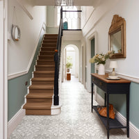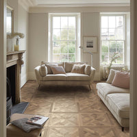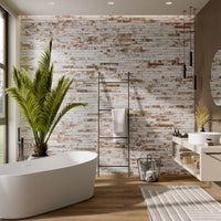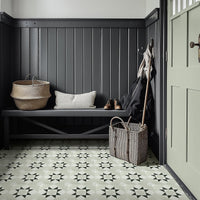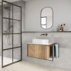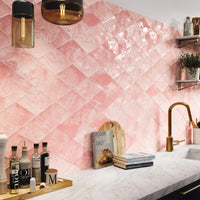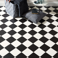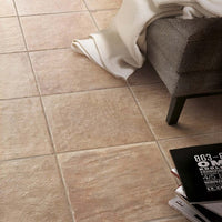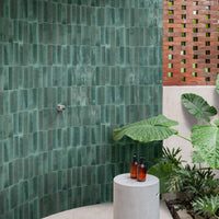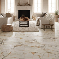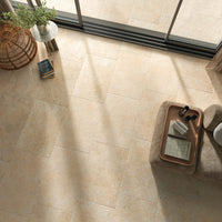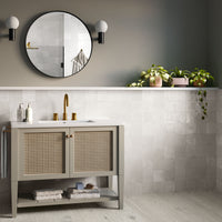
Uplifting and unusual, Veri Peri is best suited to spaces where you want creativity to flow, such as in the home office, studio spaces, or even to help with bursts of inspiration in the shower. It can inspire movement and encourage momentum, making it an ideal choice for hallways or utility rooms. It can be a difficult colour to match with existing home décor meaning smaller, self-contained spaces may benefit from Veri Peri the most.

The colour of the future
Veri Peri was chosen with the future in mind. Not just the year to come, but the many years stretching out before us and, most importantly, the technology to come. Referencing the digital age in general, and the metaverse in particular, Veri Peri is no stranger to our technological lives. Framing the colour in this way brings us to our first colour of the future styling – VR Chic.
VR Chic
Aqua, hot pink, black, and a moon-like silver are the first partners for Veri Peri. These are all dramatic colours with a lot of oomph so mix and match with care. This combo is ideal for gaming spaces, playrooms, and downstairs bathrooms.

Collections: Marais Rose, Shiraz Turquoise, Dwell Black, and Transit Silver.
As well as the futuristic vibes of VR Chic, Veri Peri’s partnership with technology can also head into the more chilled out, space age colour scheme, leading us to our second colour of the future styling – West of Venus.
West of Venus
Brushed silver, chrome, dark grey, and white give the basis of the mood. Create clean lines and mix materials for an intriguing look. Include spheres and bubbles for a bit of fun and if the space seems too cold, try burnt orange or a similar shade for warmth.

This combo is best suited to an office space as computers, laptops, and over devices will blend in seamlessly, although living rooms and hallways can also benefit from the uncomplicated colours.
Collections: Elements Brick Matt, Amalfi Grey, Swoon Grey, and Highline Graphite.
Thoughtfully optimistic
Described by Pantone as “a dynamic periwinkle blue hue with a vivifying violet red undertone blends the faithfulness and constancy of blue with the energy and excitement of red” and as “the happiest and warmest of all the blue hues” Veri Peri is designed to make us feel joyful. To match this energy we’ve created our first thoughtfully optimistic styling – Sticky Bubblegum.
Sticky Bubblegum
Cutesy colours in pastel pink and baby blue, along with peach and other sugars sweet shades mix marvellously with Very Peri. Soft shapes, textures, patterns, and tonal variation add character to this charming palette.

Perfectly suited to bedrooms, living rooms, playrooms, kitchens, and almost anywhere that can benefit from a touch of whimsy and delightful design.
Collections: Roxy Pink, Opal Sky, Ripples Pink, and Pastels Lemon.
Along with the wonderfully sweet pastel shades of Sticky Bubblegum comes another take on optimistic colouring, one which includes the colours and motifs of nature, like our second thoughtfully optimistic styling – Nature’s Friend.
Nature’s Friend
Deep greens and a hint of brown mix and play with Very Peri to create a distinctly different vibe with an entirely different focus.

Fabulous for use in dining spaces, offices, bedrooms, and bathrooms, this palette tones down the cute in favour of the organic.
Collections: Paradise, Ocean Emerald, Fez Ivy, and Alderly Walnut.
Self Expression
Looking to the future, finding confidence in individuality, possessing dynamism, and embracing opportunity all lead to the self, and with it, our final pair of palettes for self expressive styling. First up – Inside Itself.
Inside Itself
The bluish purple of periwinkle is not quite either of those things. An undeniable hint of red adds the distinguishing warmth whilst the softness and calm are very much maintained by the blue. Play with the curious look of Very Peri by adding extra blues and reds to your interior.

The warmth of the reds make it a fabulous palette for cosy living rooms and comforting bedrooms.
Collections: Victorian Red, Dorset Red, Concorde Blue, and Drops Persian Blue.
On the other end of the spectrum we have our final palette, this time finding inspiration from colours entirely different from Veri Peri. Last up – Dream Big.
Dream Big
Yellow, green, and orange can create truly intoxicating spaces when mixed with Veri Peri. Bright, lively, and full of fun, the Dream Big palette takes self- expression seriously.

Go bold in a bathroom, create an inspirational office, or enjoy the playful colours everywhere.
Collections: Pastels Lemon, Crackle Bottle Green, Sage Metro, and Albert’s Mustard Yellow.
