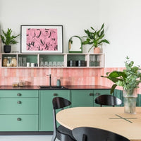
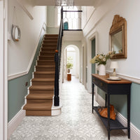
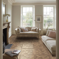
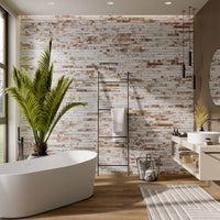
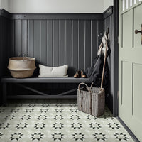
Pantone’s Colour Trends for Spring/Summer 2021 highlights a contrast between gentle and dynamic shades, with pastels - such as floral pink, turquoise, and soft marigold - to the fore. In ceramic tiles and other finishes, this cheerful palette can really brighten home interiors, capturing the full vivacity of Spring flowers.
Go bold with brights
One big fan of bright, contrasting pops of colour is Rebecca Snowden, Interior Style Advisor at Furniture And Choice.
She celebrates the way Pantone’s Spring 2021 palette takes a cue from the lively, floral tones of the season, with colours such as burnt coral and French blue providing touches of glamour and warmth against a soothing buttercream base. She recommends introducing these hues into the home with accessories and soft furnishings, but they are equally great as a feature wall, tiled niche, or splashback.
“Bringing a mix of soft pastels and energetic colours into the home can be as easy as picking the right accessories,” Rebecca advises.
“Cushions and throws work really well here, as they can be moved around to achieve the most pleasing combination and look. Beyond that, art, glassware, and even a bouquet of flowers, can add a dash of stunning colour. Here, French blue vases, soft pink walls and marigold pillows add vibrancy and style: when everything else is kept minimal and neutral, a thoughtful use of pastels will give a boost of life and freshness to your room.”
Pastel colour blocking
Pairing strong lines and gentle colours, or softer patterns and punchy shades, works just as well in interiors as it does in high street fashion. Pastels shine when paired with colour blocking and graphic looks, providing character and vibrancy without being overwhelming. Even the simplest of designs, like an arc or circle, can make an impact in the right colour.
“A colour blocked feature wall is a creative way to incorporate vivid pastels,” says Rebecca. “A marigold wall offers sunny energy but, to make sure the room feels cosy and relaxing, offset it with soft pink and cream walls, and some grounding touches of blue, with a cerulean cushion and dark blue throw.”
Tone-on-tone styling
Pastels are a good entry point when working with colour, as they’re easier on the eye than more saturated hues and have a restful quality. This translates well when styling a tonal, pastel room, evoking the personality and character of the colour without being garish.
“While a bright kelly green may be a bit much for a dining room, an airy turquoise is a modern choice, especially with a strong centrepiece as an anchor,” explains Rebecca.
“A white wooden dining set retains the breezy, relaxing feel that turquoise brings while also keeping it clean and simple, bringing everything together.”
A great way to complete the look is with darker tonal accents; such as French blue or Carnival Glass. This layering of colours and texture gives variety, depth, and visual interest.
So, what are the hot picks in Porcelain Superstore’s palette? Well, we’ve certainly got some subtle and sensuous pinks. Here are five to get you started.
Ella Pink

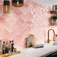
Ella is a truly gorgeous wall tile. This beauty delivers a gorgeous dusky pink; but the real appeal lies in the subtle surface shading that imbues spaces with warmth, and elegance. What’s more, the hexagonal shape couldn’t be more on trend; while the exquisite surface delivers an authentic hand-made aesthetic, with a rippled finish and glossy glazing that as good as it gets. Made with care in Spain, each 8.5mm thick tile measures 108 by 124 mm.
Ripples Pink

Also hailing from Spain, our best-selling Ripples Pink works the classic 100 by 300mm subway format to perfection. This tile’s rosy shade makes a great alternative to more clinical whites. Fresh and uncomplicated, these tiles suit a variety of applications: such as a striking splashback in a contemporary kitchen. With the rippled surface delivering a soft pink blush, these tiles have a glossy finish that is super easy to keep clean.
Corsica Hex
To get the contrasting bright blue/green accent, look no further than Corsica Hex.

This 120 by 138mm hexagonal stunner will bathe your home in an authentic splash of the Mediterranean. The distinctive shape somehow emphasises the depth and allure of the enticing aquamarine colour. This is a deeply delicious design: the rich gloss shading bringing to mind the glittering bays and fabulous beaches of Summer holiday dreams.
Pastels Lemon
Of all this Spring’s accent hues, yellow is perhaps the one to approach with the most caution. As we all know, there is yellow … and then there is yellow. Some are very acid; an individual taste. But other are just too insipid: not packing enough punch to really pop. And then there is Pastels Lemon. It is, in a word, perfect!

These versatile rectangular pieces - 75 by 300mm – are a true lemon yellow: a surprisingly warm tone that is emphasised by the glossy finish. Made in Italy, they deliver exquisite detailing with gently uneven edges and subtle surface shading. This is a pop of colour with a sophisticated edge: perfect for playful walls throughout the home.
Concorde Blue
Finally, the must have blue accent for Spring/Summer 2021 is a rich, characterful blue that sits somewhere between mid and darker tones. In short, it is the blue of our deeply dramatic Concorde Blue.

This 50 by 250mm tile boasts a sleek, graceful shape, a regular polygon: essentially a parallelogram with a matching triangular ends. These glossy Spanish tiles are proof positive that great, on-trend design needn’t break the bank.
