Colour is everywhere in our world, but when it comes to our homes, many of us lack confidence in our use of colour. We are wary of making choices that will look dated in a few months, or creating jarring colour clashes.
That is one reason why property programmes, like Homes Under The Hammer and Location, Location, Location stress the importance of neutral colours when decorating a house ready to put it on the market.
However, as how many of us have gone round to a friend’s new home and commented: “This is awesomely bland!” or “I love this space: it’s so wonderfully neutral!”
Consider Blickling Hall, Kenwood House, Burghley, Somerleyton Hall, and Sudeley Castle – all historic houses famed for their interiors – and one thing they all have in common is sumptuous and sophisticated use of colour.
Along with the visitors to these historic homes, most of us instantly recognise great use of colour, whether in a painting, and interior, or on an item of clothing. This proves that we all have the innate ability to make great colour choices: we just lack the nous.


One answer is to draw on the knowledge and advice of experts and then translate this in your own home. Two of the most inspirational speakers on the subject are Leatrice Eiseman, Executive Director, and Laurie Pressman, Vice President, both from the Pantone Color Institute. Pantone is one of the world’s foremost repositories of colour expertise and, each year, produces a series of very influential palettes that predict the fashionable tones for the year ahead.
At Porcelain Superstore, Pantone’s expertise is one element we always factor in when selecting new designs for our ever-growing portfolio. Here we would like to share just one of Pantone’s palettes for 2021. We’ve chosen Vivify because if ever there was ever a time when we needed to surround ourselves with colours that infuse feelings of positivity into our environment, it is now.
As we continue down this path of uncertainty, a time marked by a global pandemic and social distancing, coupled with social unrest demanding action on equality and sustainability, a cheerful palette expressing a sense of playful freshness and uplift gives us energy, helping us to recharge as we chart our path forward.
One part of Pantone View home + interiors 2021: Vivify is a particularly cheerful palette expressing freshness and positivity. It is symbolic of the brighter future that lies ahead. Displaying a youthful spirit, this decidedly upbeat palette expresses a sense of playful freshness and optimism that brings a smile to our face as it takes us forward.


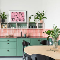
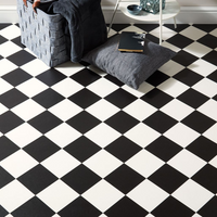
The Palette comprises nine colours: Black Beauty, Meadowlark, Morning Glory, Raspberry Sorbet, Aquarius, Spearmint, Sugar Swizzle, Wild Lime, and Easter Egg. In an adventurous exploration of newness and originality, Vivify highlights the dichotomy of an intense black with a sugary white, and the dramatic impact made by this classic pairing when contrasted against a more vibrant sunny yellow, bold hot pink, delectable raspberry, and tangy lime. Adding to the liveliness is a periwinkle blue, a watery turquoise, and a cool spearmint green.


As home owner, you may wonder how to incorporate these colours into your home, or how to source just the right shade from your local DIY or specialist decorators shop. One tool that you may find helpful is one of the on-line specialist colour sites – we like encycolorpedia but there are others – that break down specific colours like these Pantone references into RGB (the name of the model coming from the initials of the three primary colours, red, green, and blue). By combining red, green, and blue in various amounts it is possible to reproduce an almost limitless array of colours.
With this RGB information, it is quite simple to play with colour combinations on your laptop or tablet, just using basic word processing or drawing software. This will allow you to get a much better idea of how you can use bold colours like the Vivify palette to infuse your home with freshness and vitality.
Let’s take the Vivify colours one by one:
- Meadowlark (Pantone 13-0646) is a medium light shade of yellow. In RGB it is comprised of 92.55% red, 85.88% green, and 32.94% blue.
- Morning Glory (Pantone 15-1920) is a medium light shade of pink. In RGB it is 91.37% red, 50.98% green, and 62.75% blue.
- Raspberry Sorbet (Pantone 18-2043) is a deeper shade of pink. In RGB it is 82.35% red, 21.96% green, and 42.35% blue.
- Aquarius (Pantone 16-4530) is a shade of cyan: the classic printer’s blue. In RGB it is 25.88% red, 67.84% green, and 83.53% blue.
- Spearmint (Pantone 15-5819) is a shade of green-cyan: an achingly fashionable contemporary hue. In RGB it is 39.22% red, 74.9% green, and 64.31% blue.
- Sugar Swizzle (Pantone 11-0607) is this palette’s go-to neutral: a very light shade of brown. In RGB, it is 95.69% red, 93.33% green, and 90.98% blue.
- Adding real zing - and reminiscent of Chartreuse - Wild Lime (Pantone 13-0540) is a medium light shade of yellow-green. In RGB it is comprised of 76.47% red, 82.75% green, and 38.82% blue.
- Easter Egg (Pantone 16-3925) is a versatile medium light shade of blue. In RGB it is comprised of 56.86% red, 60.78% green, and 78.82% blue.
- Finally, Black Beauty (Pantone 19-3911) is the ultimate dramatic accent colour: a dark shade of blue-magenta. In RGB it is comprised of 15.29% red, 15.29% green, and 16.47% blue.
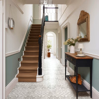
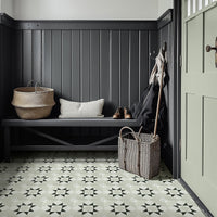
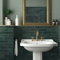
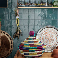
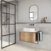
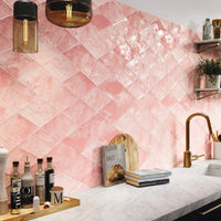
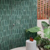
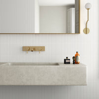
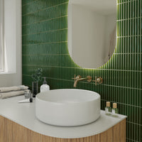
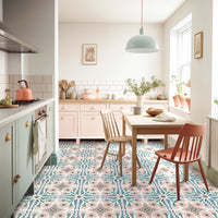
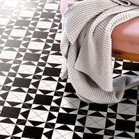
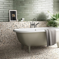
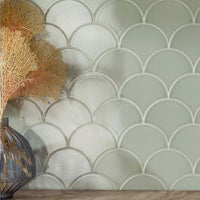
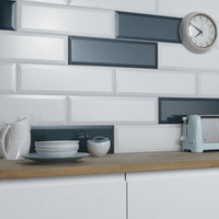
Have a play with these colours and then come back to our product portfolio with fresh eyes. You may find new appeal in plum, sage or teal metro tiles; or the brighter colours of ranges such as Concorde, Cosmo, or Bon Ton. Whatever you choose, always colour with confidence!
Find the path to great colour at Pantone.com
