Continuing our series of posts on tile design trends, this time we turn to Spain, specifically Castellon, the tile production hub near Valencia.
This town is the headquarters of Ascer, the Spanish tile manufacturers' trade association: one of the main sources of information about all things tile-related. Working in conjunction with The Home Trends Observatory, and The Institute for Ceramic Technology, Ascer has recently published the 2020/2021 Trends in Tiled Surfaces report; a fascinating yet brief outline of the four colour spectrums associated with the very latest ceramic tile trends.
As Ascer fully understands, ceramic tiles afford endless different design solutions, regardless of the setting’s dimensions, or the location, whether inside or outside the home. In addition to the huge variety in tile formats, finishes, and designs, their choice of colour is fundamental to certain decorative styles.
Spanish tile brands offer collections in a huge variety of colours and shades, and are thus able to bring almost any colour scheme to life, while at the same time delivering the practical benefits of ceramic tiles, such hygiene and stain-resistance.
Colour Spectrum 1 - Natural Tones


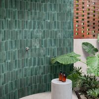
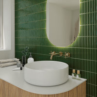
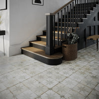
NATURAL is the first colour strand identified in the report. Based on organic colours; this trend pays tribute to man’s natural origins, with tiled walls and floors that go back to basics.


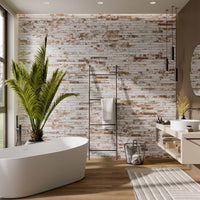
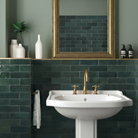
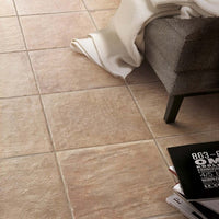
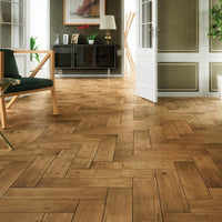
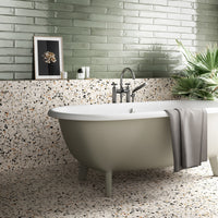
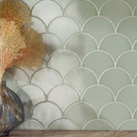
Organic colours evocative of nature prevail, from greens that conjure up vegetation, like moss or mint, to terracotta's multiple hues, with its oranges, natural wood-like shades and greyish browns. Terracotta plays a key role in this colour spectrum, thanks to its natural, earthy, tactile appeal. Let’s go back to nature!


Colour Spectrum 2 - Simplicity Palette


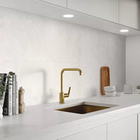
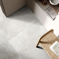
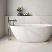
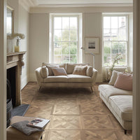
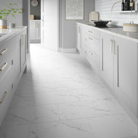
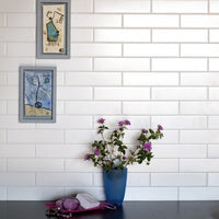
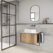
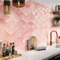
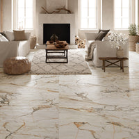
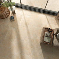
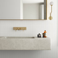
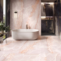
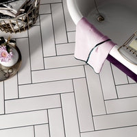
The SIMPLICITY palette offers shades synonymous with wellbeing. With this trend, tiled walls and floors foster a genuine sense of wellbeing, and colour also plays a fundamental role in helping to create the right atmosphere. In this case, the emphasis is on soft colours. They include cloudy shades of white and neutral warm colours, like beige or pink, able to generate a warm, cosy feel. Give yourself a hygge!


Colour Spectrum 3 - Roots Palette


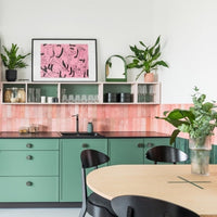
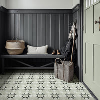
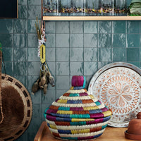
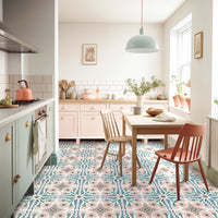
In the ROOTS palette the focus is on the hues associated with natural dyes. This trend encompasses a wide variety of different colours, with surfaces that contribute to the creation of settings with a strong evocative appeal. The colours range from muted natural shades, inspired by natural dyes or plant fibres, to more cheerful brighter yellows, blues, and reds.


When they are matched with their opposite colours, eye-catching bold combinations can be achieved or attention can be drawn to certain focal points. This is really an area where UK home owners can get bold and experiment with tiled contrasts.


Colour Spectrum 4 - Ethical Luxury


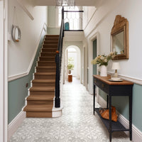
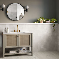
The final colour there is ETHICAL LUXURY. This group explores the fading shades of colour: an evolution of shabby chic and a nod towards the French farmhouse aesthetic so beloved of House and Garden and other up-market interior design magazines over the years.
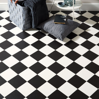
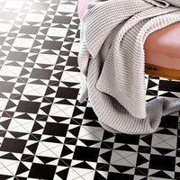
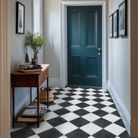
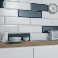
With this trend, fading shades of colour play a key role in helping to achieve a chic, sophisticated look. Dark blue and matt black, combined with certain glossy touches, are fundamental in the creation of dark settings with a sense of depth. They can be contrasted with mirror-like, brushed, or galvanized metal finishes. By using oxidised designs or fading colours, surfaces with a multiplicity of effects can be achieved. Colour yourself posh!
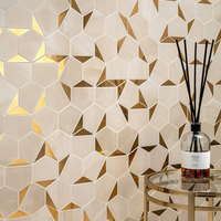
 Marble Nouveau by Roca
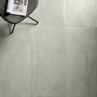
 Corten by Aparici
