Pantone has named Classic Blue (Pantone 19-4052) as the 2020 Colour of the Year. This deep blue hue – both comforting and relatable – is already featuring in a plethora of interior furnishings and fabrics, so UK home owners can expect to see a lot of this shade in the months ahead.
“We are living in a time that requires trust and faith,” explains Leatrice Eiseman, Executive Director of the Pantone Color Institute. “It is this kind of constancy and confidence that is expressed by Pantone 19-4052 Classic Blue; a solid and dependable blue hue we can always rely on. A boundless blue evocative of the vast and infinite evening sky, Classic Blue encourages us to look beyond the obvious to expand our thinking; challenging us to think more deeply, increase our perspective, and open the flow of communication.”
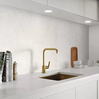
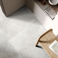
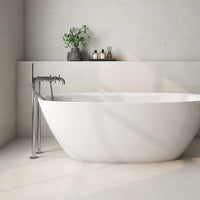
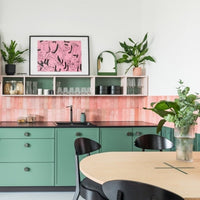
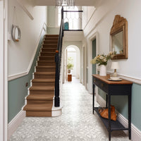
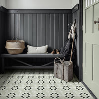
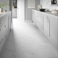
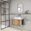
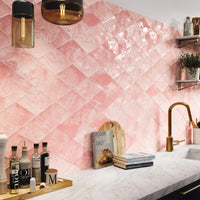
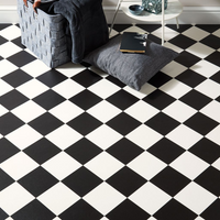
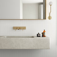
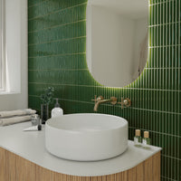
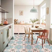
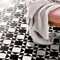
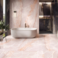
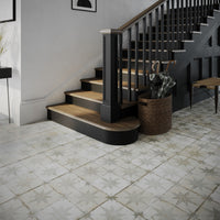
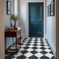
Many different tile designs will complement or contrast with this versatile hue. It works wonderfully well with neutral colours, such as white, beige and grey; but also sits comfortably beside wood-effect tiles, metallic accents, and even highly patterned designs.
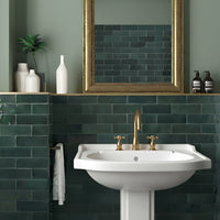
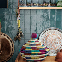
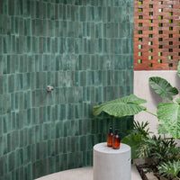
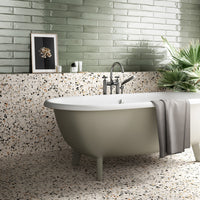
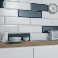
Tiles themselves are a great way to incorporate blue into your home. They can be used beside Classic Blue painted walls, or paired with grey, white, or marble effect tiles. Blue tiles provide a clean and fresh look, while adding a dash of exuberance, as shown below.

Why not use flooring with hints of blue or create a blue backsplash to infuse life and personality to an otherwise neutral kitchen or bathroom. Below, Saigon Blue is teamed with mid-tone wood effects to deliver an effortless contemporary vibe. Classic Blue can also work well on the faces of kitchen cabinets, delivering a sense distinction to spaces defined by neutral tones.

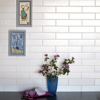
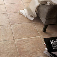
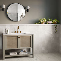
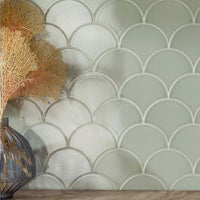
This effective combination can be flipped by pairing Classic Blue walls with warm neutral wall tiles. This pairing brings restful harmony to bathrooms and other living spaces. You can add further visual interest by combining different textures, finishes, and shades, achieving an effect that is both classical, yet deeply personal.
[stnsvn-col-row][stnsvn-col-2]

[/stnsvn-col-2][stnsvn-col-2]

[/stnsvn-col-2][/stnsvn-col-row]
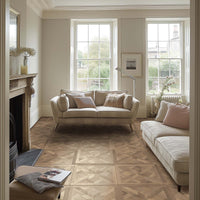
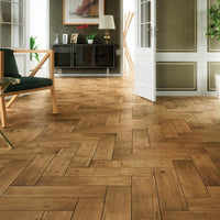
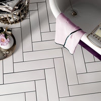
Classic Blue walls also bring the best out of the current generation of subtly stained wood-effect floor tiles. Above right is our Chevron Grey wood tile. Pair with Pantone’s statement blue for a subtle variation on classic Scandi chic.
Pantone’s annual colour, which is announced each December, reflects “what is taking place in our global culture at a moment in time.” While some have seen this year’s Pantone colour as a rather safe choice – perhaps a reaction to naming a shade based on climate-challenged ocean coral, Living Coral, as its Color of the Year in 2019 – Pantone remains a very influential colour authority. So, this year, it is not just Chelsea fans who will feel blue is the colour.
- Pantone remains a very influential colour authority. So, this year, it is not just Chelsea fans who will feel blue is the colour.