Ever decided to give the bathroom a fresh lick of paint on a whim? Let’s face it, we’ve all been there.
What starts off as a noble idea for the weekend quickly turns frustrating, as tester pot after tester pot is cast aside. Finally, you settle on a colour only to start painting and discover it’s actually The Wrong Shade. Oh well, it only means yet another trip to B&Q or a few more hours spent on Pinterest.
The problem is, too much choice can sometimes be a little overwhelming and make it difficult to find exactly what you’re looking for.
I’m writing this from first hand experience. Recently we decided to re-tile our dated ensuite to bring it into the modern age. And could we both agree on our favourite tiles? Of course not. So in a good-natured spirit of compromise we decided to Google what colour trends lay ahead…
…and Google very kindly assisted us, by directing us towards Pantone.
The self-described world authority on colour, each December the Pantone experts poll designers and manufacturers before announcing their ‘Colour of The Year’ – an ‘it’ shade that may go on to dominate the world of interiors and design in the year ahead. And they don’t pick at random – instead they choose a colour that best captures the current zeitgeist and social trends.
So which colour picked up the gong for 2016?
Well, for the first time ever, they picked two – Rose Quartz and Serenity. A duo of pastels – shades of pale pink and muted blue – that are often naturally paired together in the home.
As Pantone rightly say, these colours “demonstrate a balance between the warm embracing rose tone and the cooler tranquil blue” and represent the trend for mindfulness and well-being. They’re not in-your-face colours that demand instant attention. Nor are they sugary sweet baby colours.
I’m inclined to agree, these are pretty soothing shades that will make a relaxed choice in any room. We’re currently looking to bring them into our little ensuite – more on that below. In the meantime, let’s look at a couple of ways you can introduce them into your home.
Kitchen
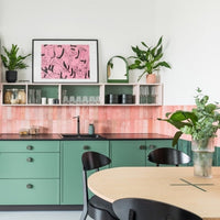
I’m not going to suggest you paint your cabinets pink or replace your granite worktop with something a little more blue… Or maybe I am. A few brave souls have jumped in on the trend quickly, and the results are pretty impressive. What do you think?
If you have a neutral kitchen scheme, then accessories are a great way to bring pastels in without dominating the room. And where better to begin than with the iconic KitchenAid mixer – now proudly available in the Pantone-influenced Guava Glaze and Cornflower Blue.
Why stop at mixers? The classic Smeg range of fridges and appliances has been available in similar shades for a couple of years now – and don’t you think these colours are perfect match for their retro 50s style?
If you fancy a bit of Scandi-Sweet then take a look at Littala’s Sarjaton range. Or if you’re really loving the Colours Of The Year, nothing beats a brew from Pantone’s official mug. And look, it’s even got the exact colour codes on, lest you forget.
Bathroom
It goes without saying that towels are the obvious choice if you’re looking for a quick and easy update – and thankfully candy coloured examples are pretty easy to find. But why stop at towels when pastel shower curtains, bathmats and other paraphernalia are pretty easy to find.
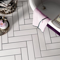
Baths and basins are a little more difficult – after all, these colours may look fresh now… but the same was once said for Avocado suites! However, if you take a look around there’s a few good examples that will still look great in a couple of years time. Take a look below – the ‘Collage Cabinet’ from Italian design company ex.t is pretty understated whilst the gorgeous freestanding tub from Drummonds is perfect for that hotel bathroom look we all crave.
Paint
Fifty years ago, ‘Paint it Black’ by the Rolling Stones was number one in the charts. Somehow, ‘Paint it Serenity Blue and Rose Quartz’ doesn’t have the same ring to it, so don’t expect this song to hit Spotify any time soon.
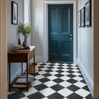
However, do expect to see pink and blue painting a town near you soon. I’d happily use Serenity on entire walls – I think it’s a great base for black and white prints. Rose Quartz I’m a little less sure about – it’s probably a better choice for an accent colour such as the door below. Either way, don’t be afraid to combine the colours as Pantone intended.
Tiles
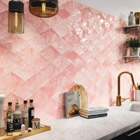
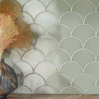
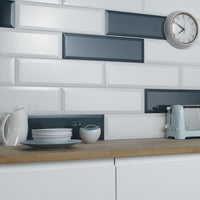
Two of our most popular wall tiles for the past six months have been Metro Duck Egg Blue and Opal Sky. Given that these two colours are not too dissimilar to Serenity Blue, it appears our dear customers have very fine tastes. But we knew that anyway! We’ve just introduced a brand new collection of small format wall tiles and I have a sneaky feeling that Crackle Pink might be a favourite over the coming months.
Our Stardust range is available in a fair few colours with Violet and Sky Blue being very similar indeed to the Pantone winners. With their designer sparkle they’re a great choice for achingly trendy homes.
In a bathroom, use one colour on the floor and the other on the wall, or bring in Pearl White for a more subtle approach. There’s matching mosaics for your kitchen splashback or wet room floor. Watch out for our new plank sizes which will be hitting our site this autumn.
