The kitchens, bedrooms, and bathrooms featured on most American interior design websites are just too large to readily cross the Atlantic. But, thankfully, every now and then, these sites throw up a bijou scheme that really packs a punch ... and would rock in the UK.
A great example – one that appeared recently on Houzz - is this 1920 house in an historic neighbourhood of Houston. Here a lovely period building has been given a fresh new look – and completely brought back to life – by designer Victoria Sheffield and M Architecture.


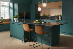
Classic details were blended with bold elements to create a striking kitchen that is now very much the hub of the home. What is so successful about this scheme is the way it blends historic character, and bold colour … while still delivering an ideal layout for a couple who love to cook and entertain family and friends.
Painted cabinets in a bold hue were the top request for these homeowners, explains Sheffield. “They love colour and didn’t want to be shy when it came time to choose one for the cabinets.”
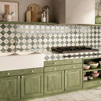
The colour they selected, Benjamin Moore’s Dragonfly, is a stunning blue-green shade that appears to change tone depending on the time of the day.


The general location of the kitchen is just about the only thing that stayed the same in this ambitious refurb project, but the design team still removed the original exposed wood lath walls to expand the footprint.
“The appliances, countertops and cabinets had been swapped out over the years,” explains Sheffield. “There wasn’t really anything worth salvaging.”
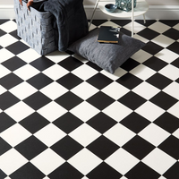
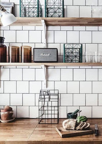
The bold design elements didn’t end with the cabinets. Sheffield also covered the walls in 8 by 8in (200 by 200mm) porcelain tiles in white featuring an alternating pattern in light and dark grey.

“The tile draws the eye up to the nearly 12ft tall ceiling, and provides a user-friendly backdrop,” comments Sheffield, who paired the wall tiles with Fantasy brown marble worktops that feature cream and taupe swirls.
“The marble was a bit of a splurge,” admits Sheffield. “I showed them different engineered quartz options, but they were adamant that we use real stone.”
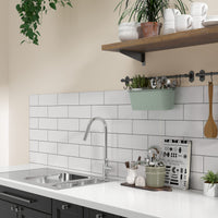
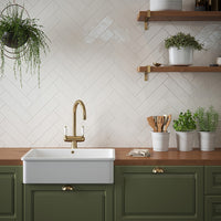
In keeping with the historic character of the home, Sheffield added a white farmhouse sink paired with a matt black tap. The open shelves above the sink provide easy access to cookbooks, while the upper cabinets have glass-front doors that keep the room from feeling too heavy.


A custom wood-panelled range hood adds another classic touch above the six-burner gas range; while a wine refrigerator and a microwave drawer are located in the island.
The lighting is well detailed. Oil-rubbed-bronze task-style wall sconces above the floating shelves provide ambient lighting and pair well with the matte black cabinet hardware; while a pair of exposed-bulb light fixtures above the island are reminiscent of upside-down mason jars, another nod to the home’s history; while integrated lights in the wall cabinets add a warm glow in the evening.
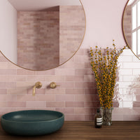
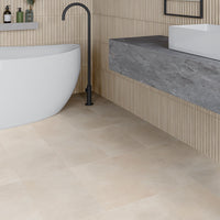
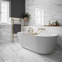
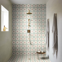
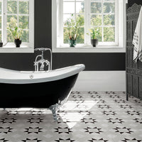
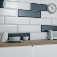
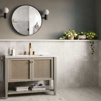
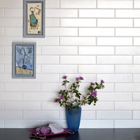
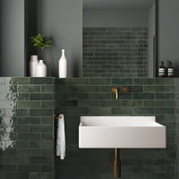
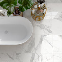
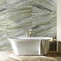
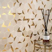
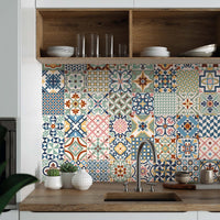
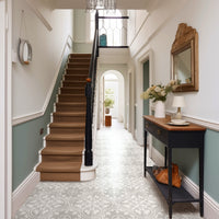
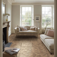
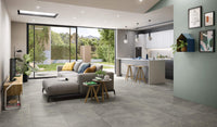
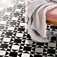
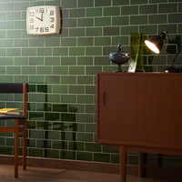
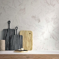
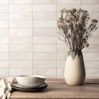
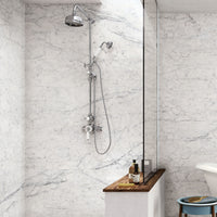
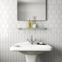
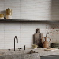
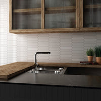
At Porcelain Superstore we can really help you create this kind of look. Our extensive tile portfolio has a number of wall designs that pack a similar punch and feature suitable graphics. Check out Hove Blue, Abbey Décor, Maison Classic, Maison Belle, or our Fiore or Geo designs from the Cotto range.
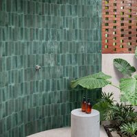
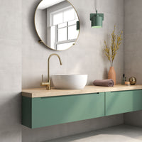
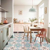
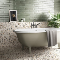
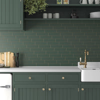
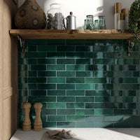
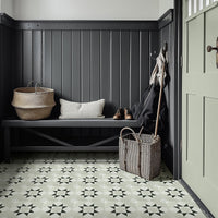
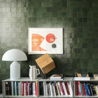
Or you can take this bold green cabinetry with feature tiles idea and give it a whole fresh twist with tiles like Casablanca, Heritage Star, Fitz, Palm Springs, or Saigon Dark.
As Sheffield has shown in Houston, bold designs can really make smaller spaces sing.
Photography: Sonya Sellers Photography
