

Bullitt, the cult 1968 American movie directed by Peter Yates, is probably best known for a fast-paced car chase in which Steve McQueen, driving a V8 Ford Mustang GT Fastback, pursues two iconic hitmen in a Magnum V8-powered Dodge Charger, up and down the precipitous streets of San Francisco.

What’s that got to do with tiles? Not a lot, to be truthful, but please indulge us. It’s a neat way to highlight the current interest in retro paint colours; which reached their zenith around 50 years ago with the palette produced by the Ford Motor Company for its Maverick, Mustang, Fairlane, and Falcon models.
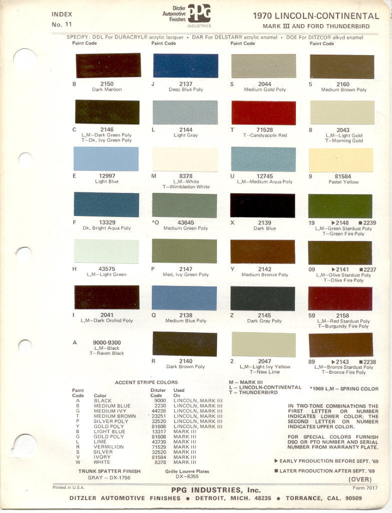
These high-powered muscle cars were offered in 24 rich shades: including Dark Maroon, Dark Ivy Green, Candyapple Red, Original Cinnamon, Acapulco Blue, Grabber Green, and Anti-Establish Mint (perhaps the greatest colour pun of all time). Let's take a look at some of the original colour swatches...

These vintage hues now have UK home-owners swooning, just as car buyers did in the golden age of USA automobiles. While safe, neutral colours have ruled the interior design world for years, we’re now seeing similar exciting hues take a front seat. And, although many of these colours may seem new, most are actually flashbacks to palettes of the past.

In this era of maximalism, the paint and decor colours of the 1970s are among the key influences on today’s design palettes. In the 1970s, the trend moved away from the bright and psychedelic colours of the 1960s into more rich and natural shades - the kind shown just below:

These 1970s colours were far from neutral; often being inspired by the more colourful elements of nature. Everything from cars and carpets to stoves and refrigerators could be found in shades like Avocado Green, Harvest Gold, and Burnt Orange. Though the industry may have gone overboard with these iconic colours in the 1970s, many have been reformulated for today’s homes.
Harvest Gold
Sherwin-Williams’ Ceremonial Gold is an updated colour that warms up any room. Harvest Gold is one of the most recognisable colour from the early 1970s. This warm and inviting gold was the focal point of kitchens, popping up on appliances, linoleum floors, and even wallpaper. Decorators in the 1970s used Harvest Gold as a neutral, the way we use beige and grey today.

When the colour schemes of the 1980s were developed, Harvest Gold was among the last of the 70s colours to get phased out because it was so popular. Gold can be a dynamic colour in any decorating colour scheme, but finding the perfect one can be elusive. So always paint a trial patch before committing to a whole wall!
Avocado Green

Much derided, Avocado Green back in vogue now, although the Avocado name has fallen from grace. Bermuda Grass by Behr Paint (63.14% red, 62.35% green, 47.84% blue) brings a fresh update to this decades-old colour. Of all the iconic 1970s paint colours, avocado green was one of the most versatile. It has evolved slightly as a hue, with the new shades being less muted and more dynamic.
Burnt Orange
Though today’s oranges are not as vivid as those of the 1970s, colours like Behr’s Japanese Koi (85.88% red, 47.06% green, 26.27% blue) can bring energy to any space. It is a great substitute for Burnt Orange: a key hue for the 1970s decorating scene.

Decorators and homeowners weren’t shy about including it in most designs, even for carpeting and worktops. While we don’t recommend covering your floors in orange tiles, this vibrant colour can still have a place in your palette. Today’s orange paints are softer and make a warm accent colour for kitchens or dining rooms.
Autumn Brown
Valspar’s Mystic Taupe (shown below) or Benjamin Moore’s Clinton Brown, continue the tradition of rich, earthy browns from 1970s. Autumn Brown was a rich and rustic brown that was popular in 1970s. Although this brown was quite dark, it had a soft and muted look.

Today’s popular browns are crisper and more neutral. The right brown can anchor a rustic neutral colour palette or complement pastels in a contemporary space, but watch for unexpected undertones. Dark brown can also be used in place of black or navy blue in almost any colour scheme.
Barn Red
Red will always be a popular paint colour, especially for accents and front doors. Behr’s Red My Mind, shown below, is a beautiful and warm red that brings energy to an eclectic dining room. It is a modern take on Barn Red: one of the most popular red shades in the 1970s. Today, it’s still easy to add red to most interior decorating styles, especially as an accent colour.

The most popular 1970s red was warm and earthy, rounding out a palette that could be easily considered autumnal. There will always be a place for red, both cool and warm, in home decorating. If you love the colour but can’t find a way to incorporate it into your home’s interior, it can also be the perfect hue for your front door and even exterior accents.